


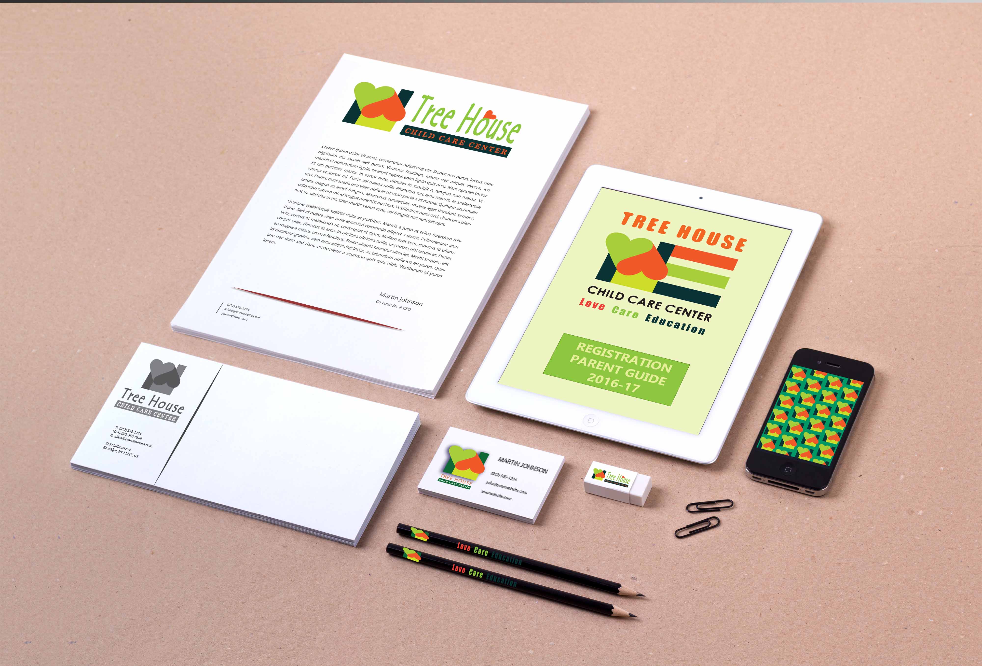

LOGO and STATIONARY for a Private Baby Centre
BRIEF – connotation with ECOLOGY, nature, care, unconditional LOVE, Montessori method, a modern holistic education ideas, society sensitivity and responsibility, empathy…
COLOURS – bright, optimistic. I’ve chosen: fresh green (nature, youth, offspring), orange (life energy, sun, warm).
CONDITIONS – the icon needed to be optimistic, with a kids-friendly look, quickly recognisable, but not too stereotypical.
ICON IDEA – When drawing the icon I dubbed it “a Cuddling Home”.
I wanted to express that the place where we leave our Precious Kids for a half a day… is not only a place where a custody policy rules, but the one, where children are cuddled with LOVE, ATTENTION and WISE & PLAYFUL EDUCATIONAL PROGRAM.
ADDITIONAL MEANING – The Kindergarten location was picturesque, close to park, nature – so I added the 3 bars (orange = life energy; green = greenery, youth; deep, dark green = a real-world environment, soil, tangible natural materials.
As well the 3 bars create a letter E – EDUCATION, which in Montessori Method means, that the younger children (ages 3-5) focus their ‘work’ on materials that develop cognition through seeing, tasting, smelling & touching. They learn through direct experience.
Leave a Reply